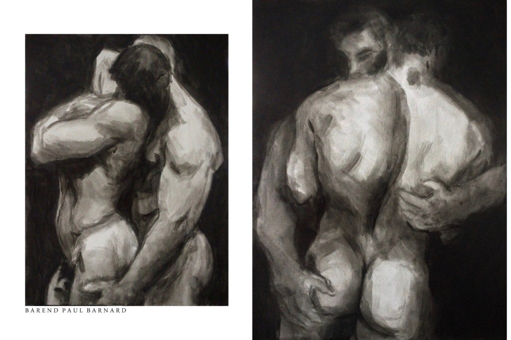
Crowded woods
By pale moonlight
Deep I dive
Til I lose sight
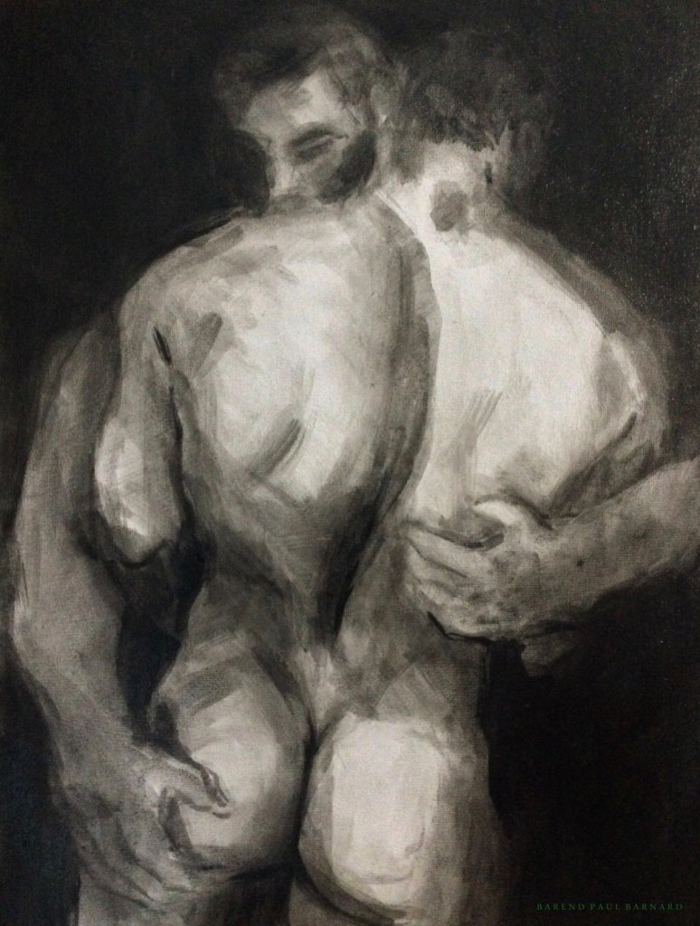
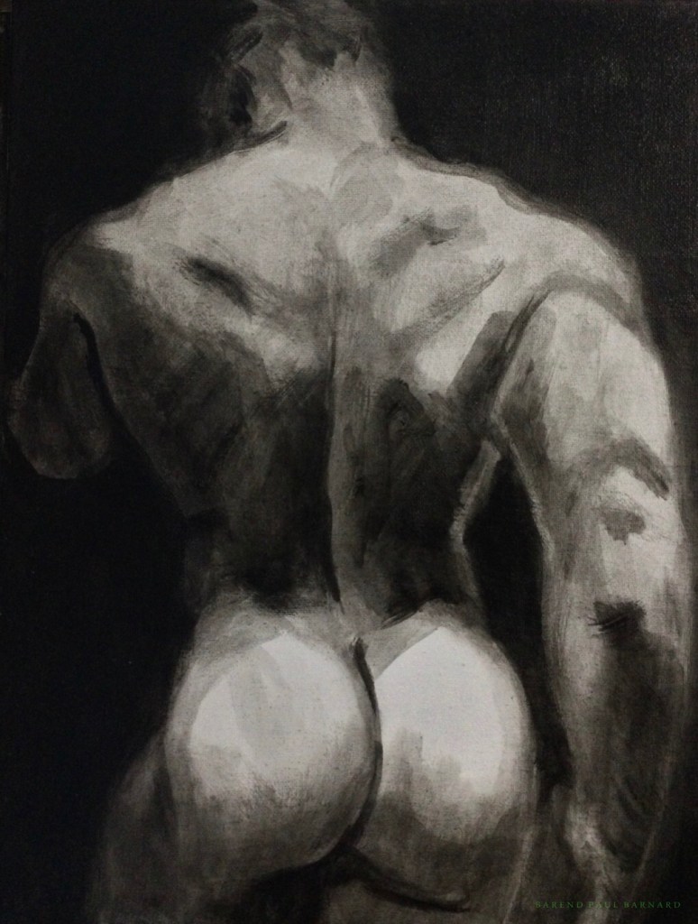
400x300mm, acrylic on canvas panel
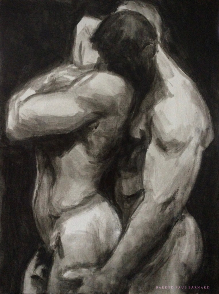
That’s when I heard
The seven voices singing
Dancing by fires
And the drumming ringing
In the midnight hours
When we still remembered
The world was ours
And hope still springs;
Septembered
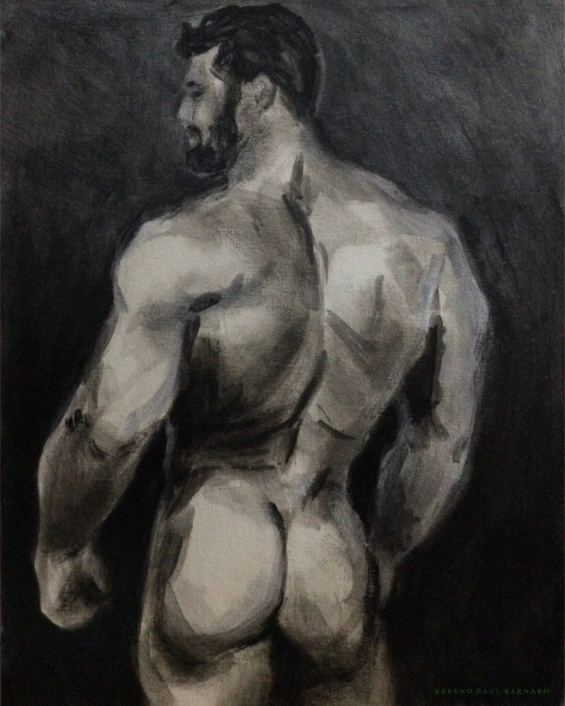
400x300mm, acrylic on canvas panel
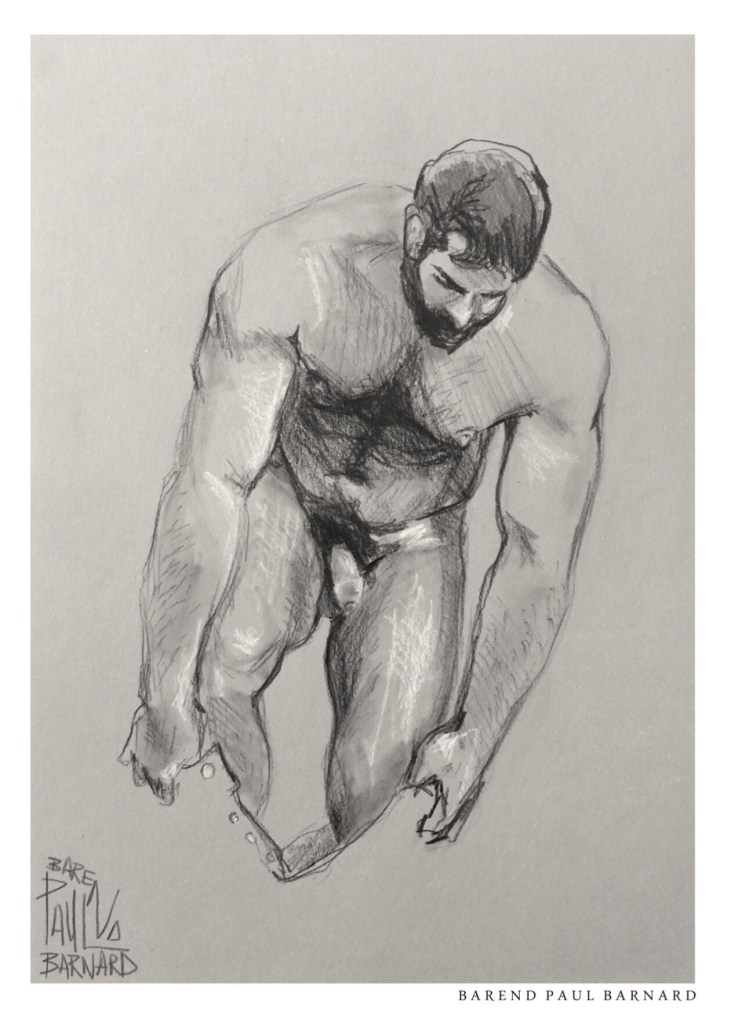
Do you still miss the sky
Do you still dream to fly
Do you too follow fallen feathers
When the rains dry
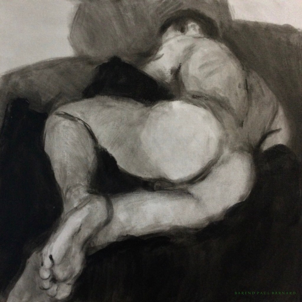
300x240mm; acrylic on canvas panel
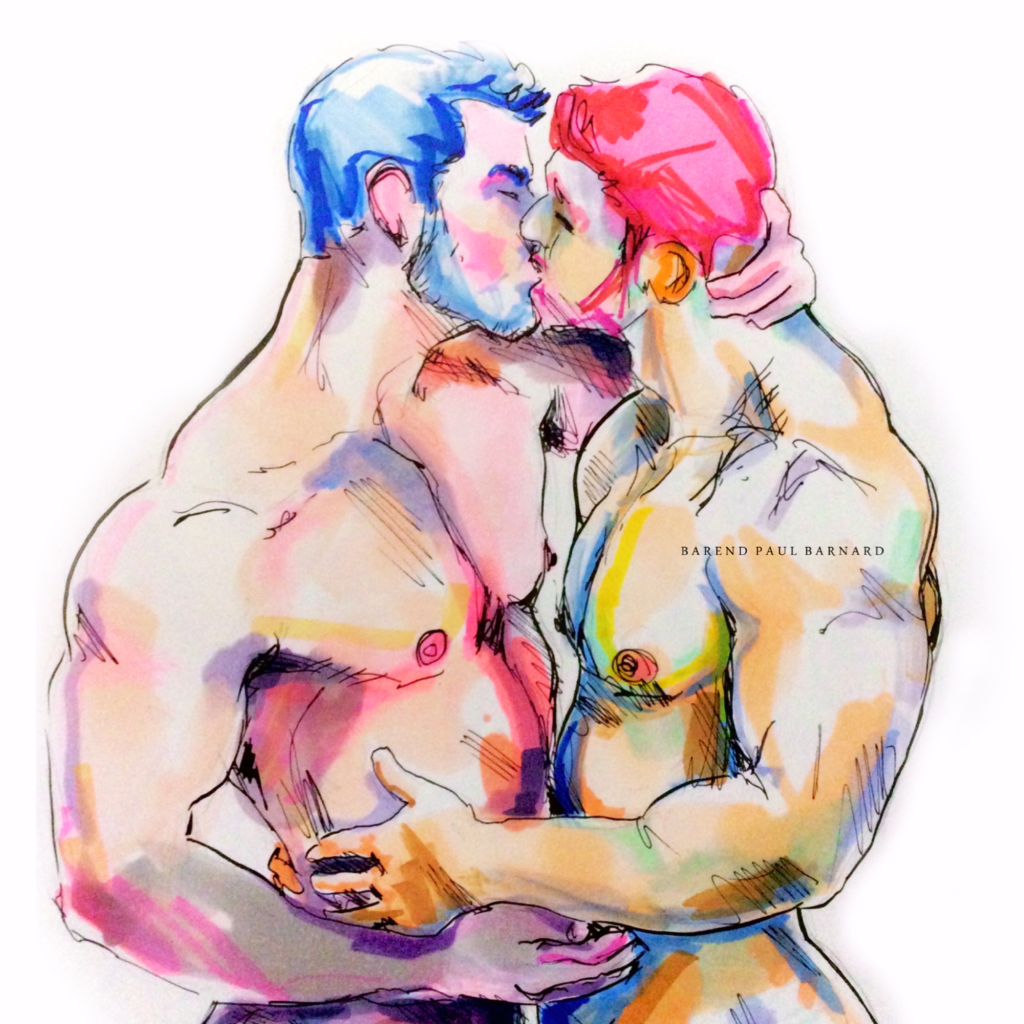
You and I are parts of poems
Written on scraps paper
Songs held safe and together
To rescue fires later
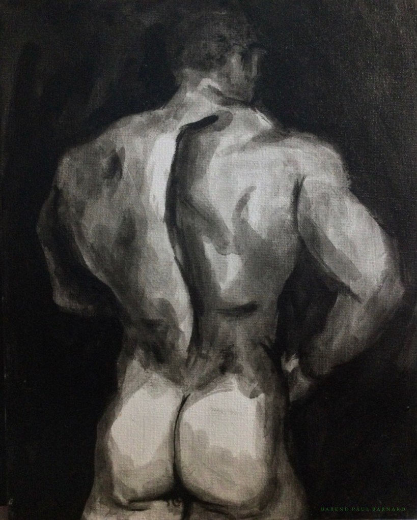
400x300mm, acrylic on canvas panel
We all hope they will remember us
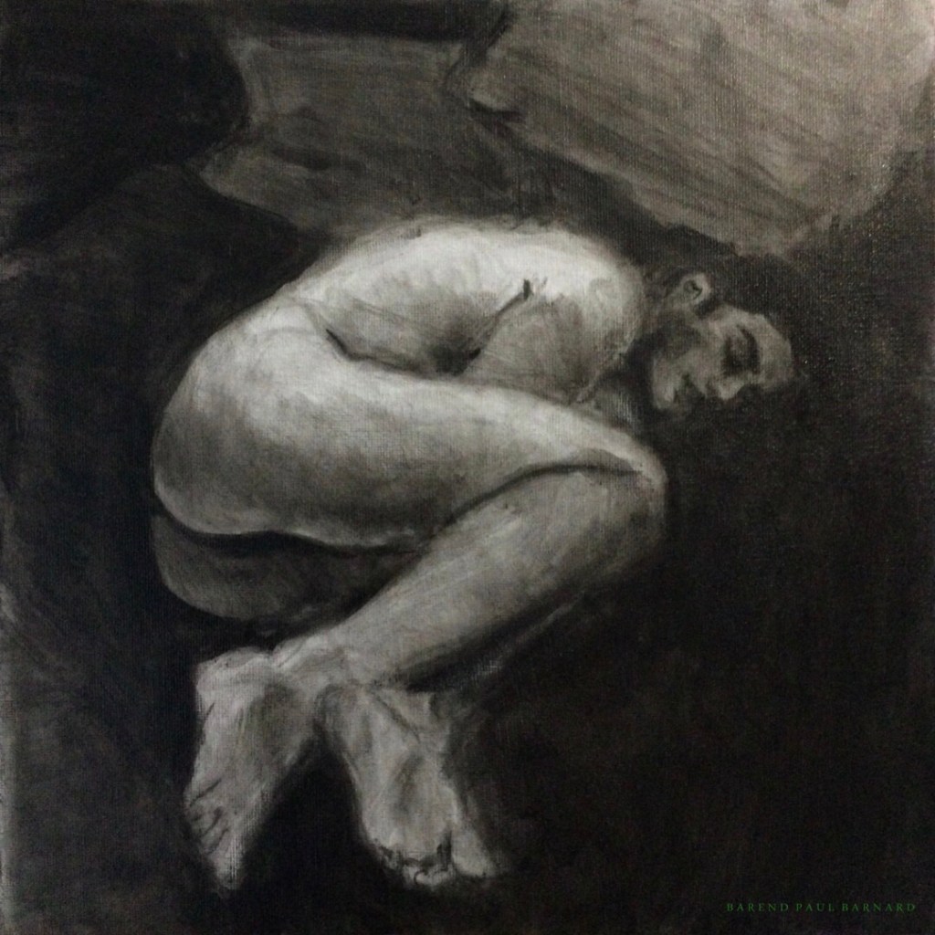
300x300mm, acrylic on canvas panel
Are we the ones who slumber
Are we the ones who fly
Once we take the leap
And forever say goodbye
-remembered
2018; Barend Paul Barnard
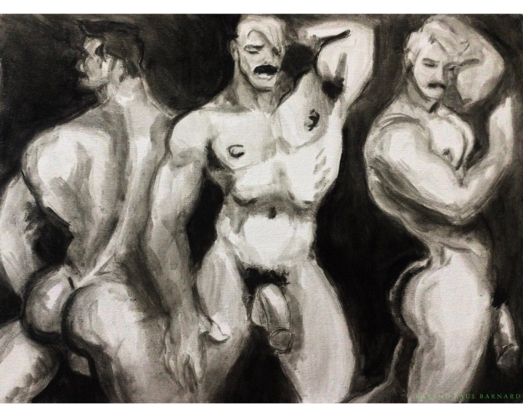
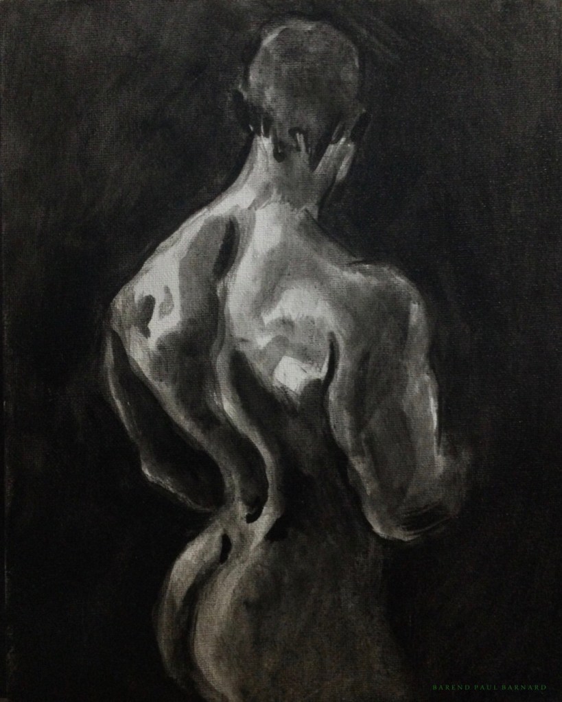
400x300mm; acrylic on canvas panel