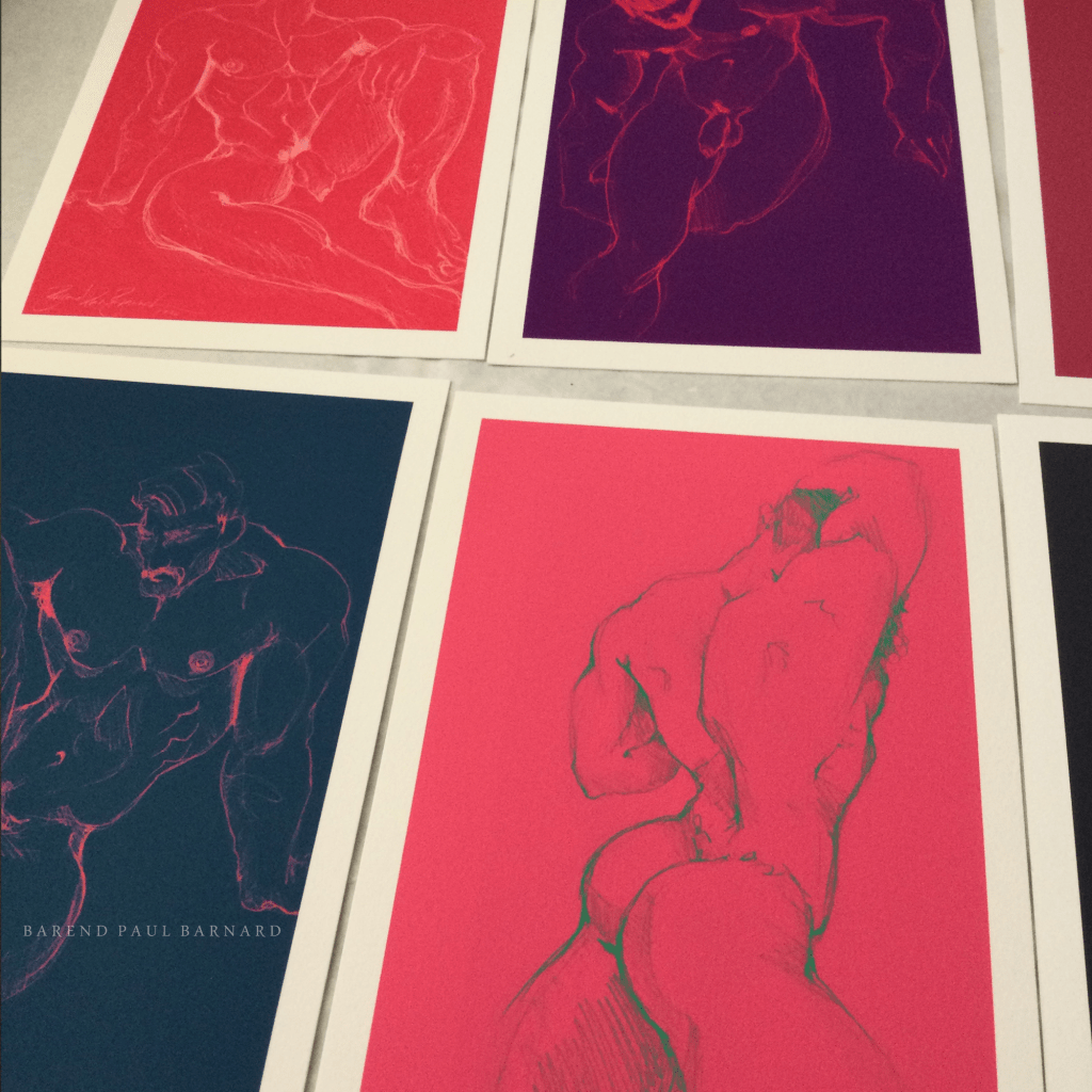
I’ve created these two print sets, one in a neutral colour palette and one in vivid colours. You’ll see its difficult for the camera to show the extra vibrant colours. Please let me know what you think.
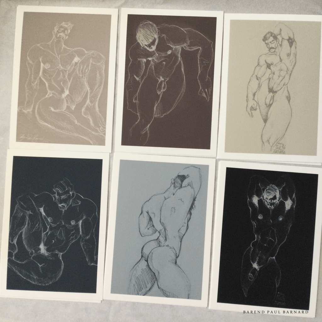
The Neutrals Collection is divided into two parts; the top row is the warm neutrals and the bottom is the cool neutrals. I think it gives one nice options for putting them together or arranging them.

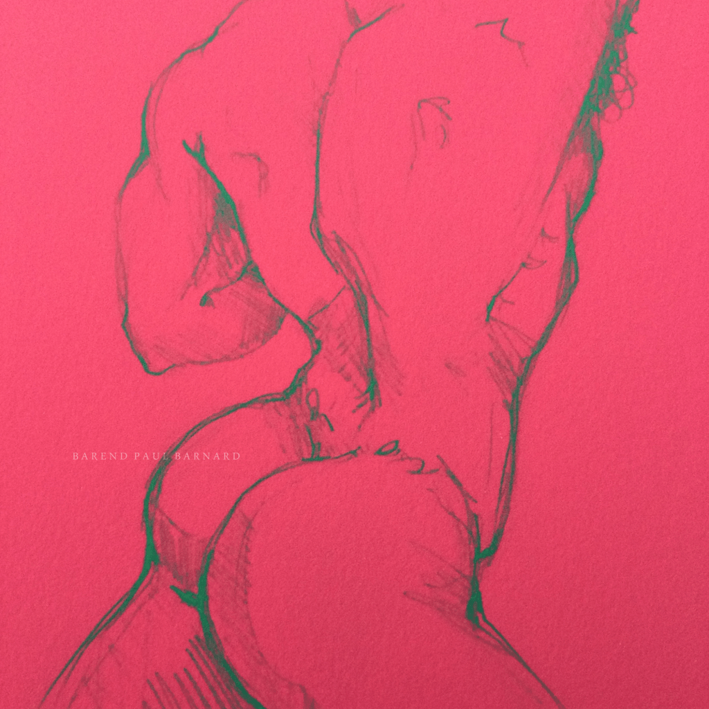
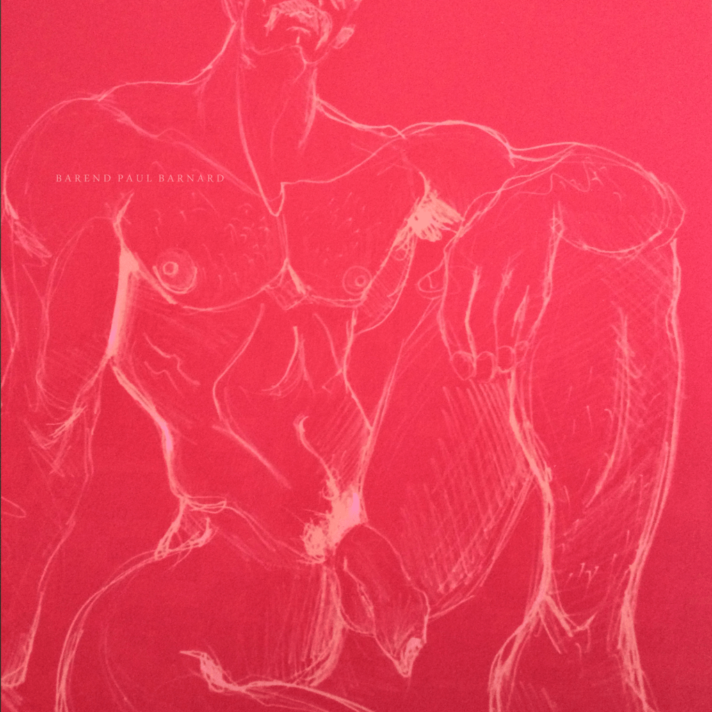
The Opera Collection is named after a modern colour you’d find in most modern artist paint brands; Opera Pink is an extremely vivid pink and as you’ll see pink ties this series together.
Each set consist of six prints reproduced on archival acid free paper with pigmented ink which guarantees that colour shifting doesn’t happen and that the colours are vibrant. The prints are 210x150mm each with a 10mm white border all around. Each panel is hand signed. A set of six costs $100.


I really like the neutrals best.
But I really LOVE your Rainbow. How much is this piece? And what are the dimensions?

>
LikeLike
Hi, thanks! The size of each panel is 210x150mm and the cost per set is $100.
LikeLike
How much is the rainbow piece?
>
LikeLike
What piece are you referring to?
LikeLike
How much for the massive divide
LikeLike
Hi Brian, I’m not sure which piece you are referring to. Please let me know
LikeLike
Gorgeous!!
<
div>Signed set of 6 for $100? I can’t pass up th
LikeLiked by 1 person
Hi Barend.
I would love to order a set of the darker /opera prints.
Can u invoice me. Add courier cost.
Gerhard van eeden Erf 494/11 Amden street St Terez 2k Hutton gate Midstream 1692
Tel 0825558782 vaneeden.g@gmail.com
LikeLike
H Gerhard, did I ever reply to your message? Sorry for the communication delay
LikeLike
hello
j’adore le set en couleur !
LikeLiked by 1 person
Merci, Guillaume
LikeLike
do you offer a set that does not show the penis. Butt is ok. Thanks.
LikeLike
Hello Raj, not at the moment; will keep that in mind – thanks
LikeLike